The Lighthouse Keeper UI/UX Design Rationale
Overall Visual Direction
The user interface design for The Lighthouse Keeper draws inspiration from vintage cinema aesthetics, echoing the game’s mysterious, story-driven tone. The sepia-black backgrounds, film grain textures, and ornate border designs were chosen to evoke the feeling of an old lighthouse keeper’s diary or a forgotten film reel — nostalgic, eerie, and immersive.
Typography is kept classic and serif-based, symbolizing the historical atmosphere of the setting, while the yellow highlight color adds warmth, visibility, and a consistent accent across all menus.


UI& UX DESIGN

WIREFRAMES


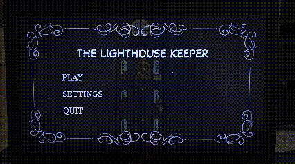
Main Menu & Settings
The main menu uses projector lighting and scroll motifs to set a calm, film-like mood. With simple options (Play, Settings, Quit) and centered alignment, it feels both elegant and story-driven.
Settings are organized into five clear categories Audio, Graphics, Controls, Gameplay, and Accessibility ensuring players can adjust preferences intuitively and quickly.
Gameplay & Controls
The Gameplay menu focuses on comfort and accessibility, allowing adjustments to difficulty, subtitles, prompts, and camera shake.
The Controls menu integrates visual icons for controllers, offering familiar feedback and customization (invert Y-axis, input switching, deadzones) for a refined, cross-platform experience.
Graphics & Audio
The Graphics menu balances performance and aesthetics with dropdowns for resolution and quality settings. The Game Boy icon theme adds a nostalgic connection to the game’s tone.
The Audio menu, featuring gramophone icons, reinforces the “sound through time” concept. Sliders for different sound layers and vibration testing strengthen immersion and interactivity.
Accessibility & HUD
The Accessibility menu promotes inclusivity with colorblind modes, adjustable text size, and subtitle options, ensuring readability for all players.
The Health & Stamina HUD uses bright yellow-orange bars for quick recognition without breaking immersion, maintaining consistent color language from menus to gameplay.
Why This Design Fits
-
Narrative Coherence: Every screen supports the game’s vintage and cinematic storytelling.
-
Accessibility & Clarity: Clean layouts and bright contrasts ensure usability in low light.
-
Consistency: Unified color, typography, and layout reinforce familiarity and flow.
-
Thematic Depth: Retro icons (Game Boy, gramophone, controller) tie gameplay to the theme of time and memory.

FINAL LAYOUT